Simply Beef and Lamb Website

Project Overview
The Simply Beef and Lamb website is a consumer-facing platform run by the Agriculture and Horticulture Development Board (AHDB) to promote quality assured British beef and lamb. The site provides educational content, recipes, and cooking inspiration to UK families and food lovers. I was the sole UX/UI designer responsible for a complete redesign—leading the project from discovery through delivery.
Goals
The main goals of the Simply Beef and Lamb website redesign were to significantly improve usability —particularly for mobile users—by creating a more intuitive and responsive experience. A key objective was to modernise the brand’s digital presence through a complete visual refresh, aligning it with contemporary design standards while preserving its core identity. The redesign also aimed to boost user engagement with recipes and increase time spent on the site. Additionally, I needed to implement a flexible content system that allowed internal teams to easily update and manage content without technical support. Finally, ensuring full accessibility compliance with WCAG 2.1 AA standards was essential to make the site inclusive for all users.
Impact
➤ Increased mobile engagement by over 40% within 6 months
➤ Positive user feedback on clarity, visuals, and navigation
➤ Reduced bounce rate on recipe pages
➤ Strengthened AHDB’s digital presence in the UK consumer food sector
Process

Research

Define

Ideate

Prototype

1. Research
- To ensure the redesign addressed real user needs and market expectations, I conducted:
➤ Stakeholder interviews with internal teams to understand business goals, content strategy, and CMS limitations.
➤ User interviews with a mix of families, young professionals, and cooking enthusiasts.
➤ Competitor analysis of leading UK recipe platforms (e.g. BBC Good Food, Jamie Oliver) to benchmark usability and engagement strategies.
➤ Analytics review of the existing site to identify drop-off points, most visited content, and device breakdown.

Key findings
-
Many users found the existing navigation clunky and overwhelming
-
Mobile usage made up the majority of traffic, but the mobile experience was poor
-
Users wanted quick filtering and visual inspiration for recipes
-
The brand felt outdated compared to modern food platforms
2 Define
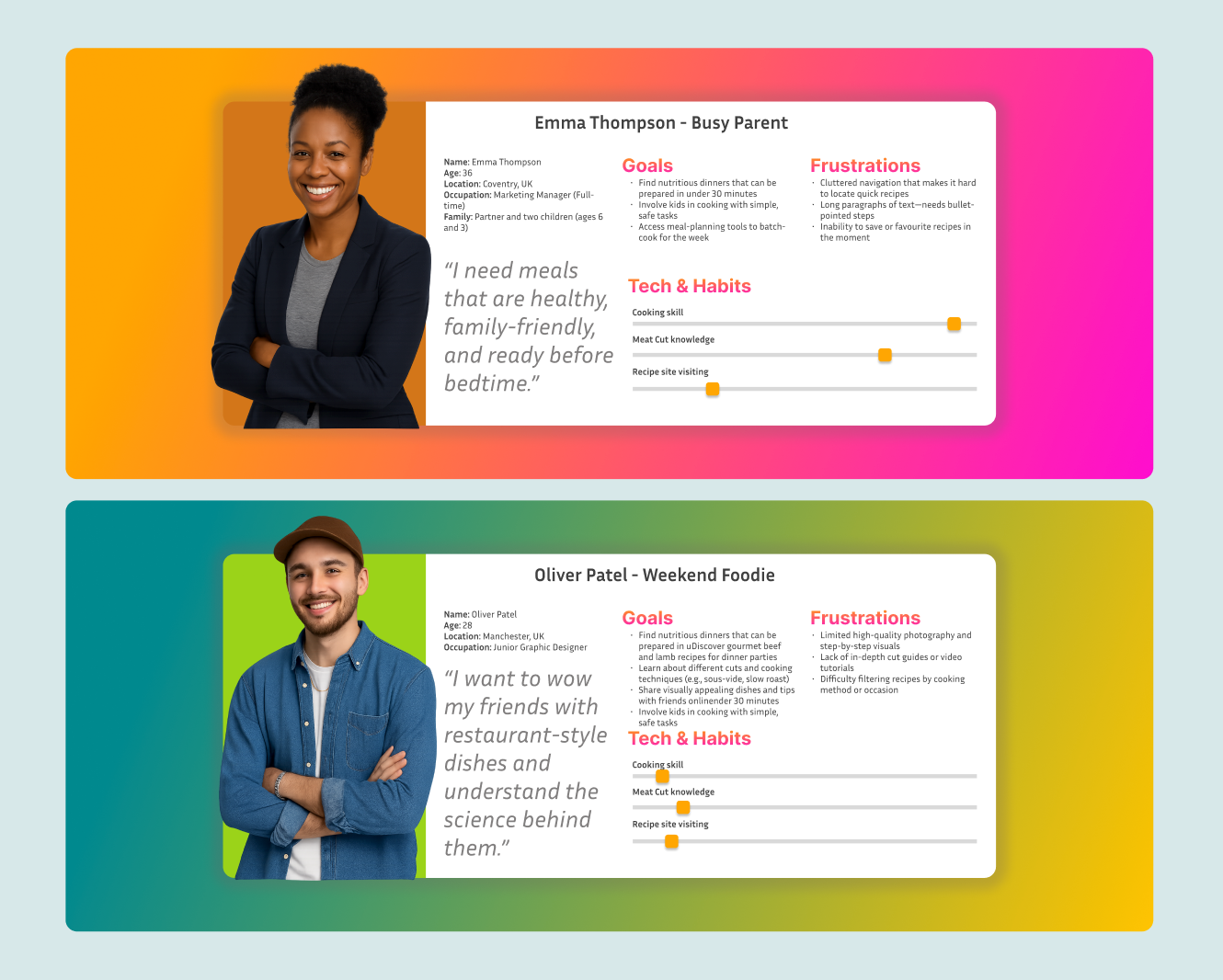
With insights in hand, I defined core user personas , Emma the busy mum, and Oliver the wekend Foodie.
User journey maps
I also created user journey map for top tasks like:
➤ Finding a recipe based on ingredients or time
➤ Understanding cuts of meat and how to cook them
➤ Learning about meat sourcing and quality assurance

Empathy Map
Busy Parent – Emma Thompson

3 Ideate
During the ideation phase, I began by running a collaborative workshop with a bench of designers, incorporating brainstorming sessions and a comprehensive mood board to explore visual directions.
I carefully selected heading fonts to convey a sense that recipes on the site are modern, light, friendly and easy to follow. Building on this, I defined a cohesive colour palette—primary colour #D7E8E9 to evoke freshness, and secondary colour #FFB91A to suggest the rich tones of roast meat.

From these explorations, I developed initial logo concepts that balanced the warmth of traditional cooking with a fresh, contemporary feel.


Sketches and early wireframes followed, allowing rapid iteration of page layouts and user flows. I then designed the information architecture, introducing dedicated sections for meat cuts, nutrition facts and a blog for deeper engagement. Finally, through targeted content-grouping exercises, I reorganised recipes and educational materials into logical clusters, ensuring users could effortlessly navigate between cooking inspiration, ingredient education and expert articles.
4 Prototype
I developed interactive prototypes using Adobe XD to validate key flows, Homepage engagement, Recipe browsing and filtering, Article and nutrition content, Cut guides with meat education.
These were tested with users remotely and iteratively refined based on feedback.

UI & UX Improvements
The redesign delivers a seamless, responsive experience optimised for both mobile and tablet devices, underpinned by a clearer information architecture and streamlined navigation. Users are greeted by visually rich recipe cards complete with intuitive filters for preparation time, dietary requirements and occasions, while the content hierarchy has been refined to boost search visibility and ensure SEO-friendliness. Overall, the site embraces an inclusive, photography-led approach that guides visitors effortlessly from inspiration to execution.